We all just love those neat maps that color the states all red and blue, especially when they turn bluer and bluer, don't we? At the end of the last presidential election, the map looked (sadly) like this (source, Wikipedia):
Candidate: Bush Kerry
Electoral vote: 286 251
States carried: 31 19+DC
Popular vote: 62,040,610 59,028,444
Percentage: 50.7% 48.3%
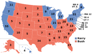
Presidential election results map. Red denotes states won by Bush/Cheney (31), Blue denotes those won by Kerry/Edwards (19+DC). The split vote in Minnesota denotes a faithless elector's vote counted for John Edwards. Each number represents the electoral votes a state gave to one candidate.
That's an awful lot of red. But it doesn't look like quite the blowout when you look at a map that truly reflects the the relative electoral college strength of each State as a function of it's size on the map, like this:
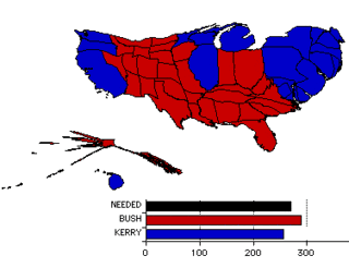
Not exactly a "mandate," is it? I started doing these in August of '04 and now is as good a time as any to put them back out there. Paul Rosenberg (who regular readers know I think is sheer genius) posted a current map of the electorate based on polling data from Polster.com that separates "strong" from "leaner" states and paints toss-up states yellow (fittingly).
By no means do I intend to duplicate Rosenberg's work here, where he makes the case that there is a "potential" for a "map changing" Obama Tsunami here based on his analysis of Swing State Clusters. But to get a feel of what he's talking about, one look at my map below should dispell the corporate media myth that this race is anywhere near close right now.
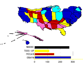
(Oooh, The Colors!)
All the usual caveats apply of course, but if the McCain camp is looking at anything close to what this map represents, it certainly explains why they suddenly look like they're desperate, trying absolutely anything they can to move the numbers.
They're acting desperate because they are desperate.
All 10 Toss-up States (yellow) were Bush States in '04, three of the "lean Obama" States (Ohio, Iowa and New Mexico) were in Bush's column too. Meanwhile, Obama is not losing a single State to the Toss-up category that John Kerry won or any leaners to McCain.
Remember, if only one or two States had flipped in either 2000 or 2004, the Democrats would have won. McCain must hold his base States and solidify his lead in all his Leaners, turn ALL the Toss-ups red and pick off either Ohio or a combination of Michigan and one of the other States Obama counts as leaning his way. To call that a tall order is the understatement of the year.
Electoral vote: 286 251
States carried: 31 19+DC
Popular vote: 62,040,610 59,028,444
Percentage: 50.7% 48.3%

Presidential election results map. Red denotes states won by Bush/Cheney (31), Blue denotes those won by Kerry/Edwards (19+DC). The split vote in Minnesota denotes a faithless elector's vote counted for John Edwards. Each number represents the electoral votes a state gave to one candidate.
That's an awful lot of red. But it doesn't look like quite the blowout when you look at a map that truly reflects the the relative electoral college strength of each State as a function of it's size on the map, like this:

Not exactly a "mandate," is it? I started doing these in August of '04 and now is as good a time as any to put them back out there. Paul Rosenberg (who regular readers know I think is sheer genius) posted a current map of the electorate based on polling data from Polster.com that separates "strong" from "leaner" states and paints toss-up states yellow (fittingly).
By no means do I intend to duplicate Rosenberg's work here, where he makes the case that there is a "potential" for a "map changing" Obama Tsunami here based on his analysis of Swing State Clusters. But to get a feel of what he's talking about, one look at my map below should dispell the corporate media myth that this race is anywhere near close right now.

(Oooh, The Colors!)
All the usual caveats apply of course, but if the McCain camp is looking at anything close to what this map represents, it certainly explains why they suddenly look like they're desperate, trying absolutely anything they can to move the numbers.
They're acting desperate because they are desperate.
All 10 Toss-up States (yellow) were Bush States in '04, three of the "lean Obama" States (Ohio, Iowa and New Mexico) were in Bush's column too. Meanwhile, Obama is not losing a single State to the Toss-up category that John Kerry won or any leaners to McCain.
Remember, if only one or two States had flipped in either 2000 or 2004, the Democrats would have won. McCain must hold his base States and solidify his lead in all his Leaners, turn ALL the Toss-ups red and pick off either Ohio or a combination of Michigan and one of the other States Obama counts as leaning his way. To call that a tall order is the understatement of the year.
 Exposing the lack of compassion by conservatives and
debunking right wing hypocrisy at every opportunity.


 Subscribe via Email
0 Comments:
POST A COMMENT