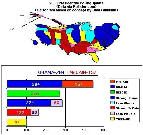
Again, I'm in debt to Pollster.com and Dr. Sara Fabrikant.
John McCain's support in Texas moved from "lean" to"strong" this week according to Pollster.com's trend analysis, shoring up his base support but not significantly moving any electoral trends away from Obama. Arizona, however, did move from the "toss-up" column I had it in last week to "strong" McCain. A big jump but hardly an unexpected development for the Arizona Senator to poll well at home. This was influenced by two new polls at the end of last month. Mississippi also trended from "lean" to "stong" McCain -- hardly an earth-shattering development.
Of concern is Pollster moving Oregon from "strong" Obama to "lean" Obama and no notable movement in the other direction anywhere else. The democrat still enjoys a 6.4% lead in Oregon according their the trend estimate of all polls, but has taken a downward swing on the latest Survey USA poll that only had him up by 3 points among likely Oregon voters.
Last week, looking at my map of the relative size of the states as a function of their electoral vote count, color-coded red and blue and shaded to indicate the depth of support for either candidate, it seemed clear why the McCain camp went so negative over the last several weeks. Looking at today's map, with the incremental movement of the polls rewarding that decision, expect a ton of the same lies and smears from the GOP right up through September.
Any data that comes out before the conventions that doesn't fit with their new paradigm will simply be dismissed by the punditocracy as people paying more attention to the Olympics, or an Obama bounce from the Denver convention. If (as I hope is the case) Obama surges in the polls and McCain does not change his strategy, opting to concentrate on trivialities and personality instead of promoting any real solution for the problems that plague the nation, by the time he doesn't realize any comparable post convention bounce to bring him to parity with Obama it will almost be too late. They will be prepping for debates and increasingly desperate, refusing to acknowledge that gutter politics undermines the only thing McCain really had going for him, his reputation for integrity, which has now been exposed as non-existent.
So the map is a big redder, but not any less blue this week. The reaction I usually get from folks is that these things just look weird. All squashed and stuff, but it makes them see the country in a new way. A notable exception is my map-maker college buddy, who diggs the hell out of them.
I think one of the reasons the thing looks strange at first blush is the morphing of the state borders. Dr. Fabrikant takes care to keep the integrity of each state's position in relation to the others, all boundaries correct and intact. However the "squashing" and "ballooning" necessary to indicate each state's relative electoral vote distorts the individual states beyond recognition, leaving too many "blobs."
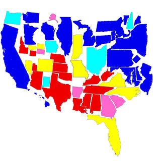
I decided to try my hand at the concept, retaining the integrity each individual state's actual shape while distorting it's size relative to the number of electors they send to select the president, while sacrificing their borders with each other. The result is kind of like taking a couple of children's puzzles of the states, of differing sizes. They will never match up correctly, but you can tell exactly which state is which if you are familiar enough with their shapes. I used the same color scheme as above to represent the relative strength of support the candidates claim according to the trend analysis at Pollster.com.
What I like about this map is that the states are all instantly recognizable. Idaho, Louisiana, Maryland and New Jersey look like what we're used to. Alaska looks small, it's not where it's supposed to be, but you can tell it has the same amount of power when it comes to electing the president as other "little-big states" like the Dakotas or Wyoming.
I also like the fact that Alaska looks like Alaska and not something you'd scrape off the bottom of your shoe. You can tell which states are supposed to be Kentucky and Tennessee instead of just a elongated blog. Washington DC looks just about as big and important as Rhode Island, Vermont or Maine, adding to the northeastern sea of blue (even though it looks like it's floating in the ocean between New York and Pennsylvania instead of nestled in between Virginia and Maryland where it would otherwise hopelessly distort the entire east coast.
A potential for confusion does pops up pretty quickly. It could be easy to mistake the four little states that on most maps take up about 20% of the real estate, and think that where I have Montana, Wyoming, North and South Dakota (below Minnesota, to the right of California) are instead the "Four Corners" states of Utah, Arizona, New Mexico and Colorado whose corners do not touch in this representation. I'll probably play around with that in future posts.
This may seem a silly exercise. However, if it serves to help you open your eyes to a new perspective on the presidential election, it serves its purpose. You can tell at a glance which side is winning this thing, and why.
 Exposing the lack of compassion by conservatives and
debunking right wing hypocrisy at every opportunity.


 Subscribe via Email
2 Comments:
Dude, give yourself some space on the left for Hawaii to sit to the west of the west coast, slide CA down a bit so Oregon and Washington can both go in roughly their correct spots, which lets MN slide up closer to its geographic locale WRT Wisconsin, and there'll plenty of white space to slot in the tiny states of Wyoming, Montana, North Dakota and the (ahem) Greatest Tiny State of South Dakota.
Working on it. You're right about moving CA. That'll free up space for Oregon and Washington to be in the right place. I already closed up all the big-little states out west and matched up the 4 corner states.
The east is really the problem, especially New Jersey. Way too big for its britches (so to speak). I still end up floating New England in Lakes Ontario and Erie. "Smooshing" everything together helps too.
I'll have an improved version by the weekend.
POST A COMMENT