 Exposing the lack of compassion by conservatives and
debunking right wing hypocrisy at every opportunity.
Exposing the lack of compassion by conservatives and
debunking right wing hypocrisy at every opportunity.


I've been looking around at other ways to visualize the election (again), and came across a BBC US Election Map Generator they use to describe our freakish electoral college system to a nation that still picks their sovereign head of state in a much more refined and old fashioned way, via funeral and coronation.
The map does what my cartograms attempt, which is show the relative power of various states in the electoral college. They do it by animating the elevation of a state (very cool on the site in some kind of flash animation I can't seem to replicate or embed). They do it in stages, the last one I reproduced here with the final results shaded the appropriate red and blue according to the latest results at 538.com.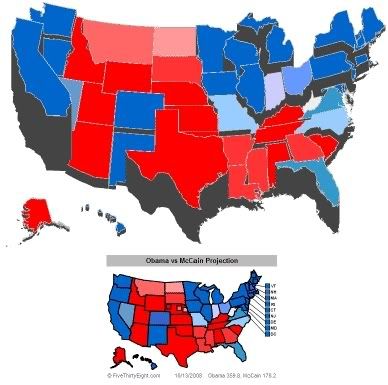 I got an email asking me what type of programing code I use for my disconnected electoral map which sacrifices contiguous states in favor of accurately projecting their real shape and sadly had to explain that it was really just the computer equivalent of cutting out the states like a child would with scissors, borrowing dad's copy machine to blow them up or shrink them according to their electoral votes, and breaking out the Crayolas.
Well, with Obama scoring a stupid lead in the CBS/New York Times poll (plus 14 really is just running up the score folks, that's two touchdowns and we usually score political matchups like hockey); I figured it was time to show just what vintage 1979 video game technology could do with my version of an election map. To my suprise, it stood everything on end and the blue representing Barack Obama's immenent landslide swallowed everything in sight.
So here it is, the state of the 2008 election according to Atari: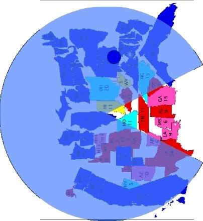 Enjoy!
10/14/08
Atari's Electoral Cartogram Generator
By: Mark W Adams
Subscribe to:
Post Comments (Atom)

 Subscribe via Email
1 Comment:
Hilarious - but true. I also like the football to hockey scoring system. Keep it up!
POST A COMMENT